Fairfield Metal
2025
New York
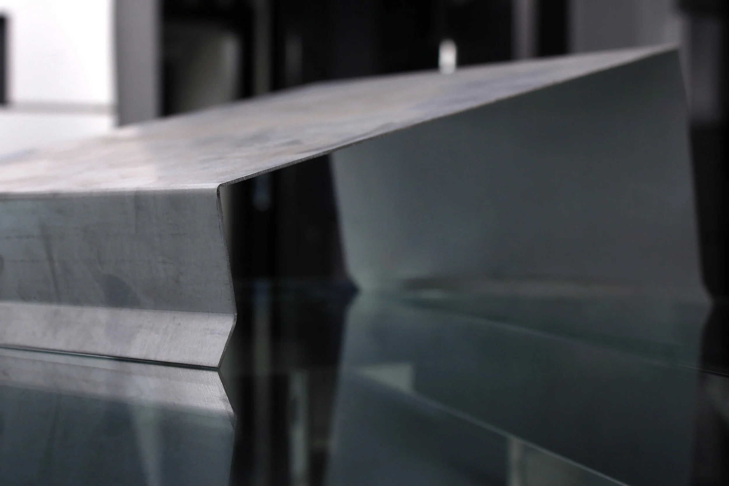
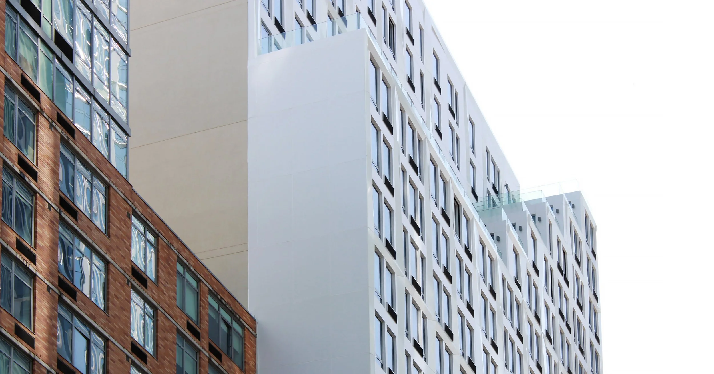
Enhanced visual identity of a leading tristate area metal fabricator. The recent rebrand initiative aims to expand outreach through compelling imagery and graphics from diverse projects in commercial, residential, and industrial sectors. Additionally, strengthening client relationships by providing transparency through new marketing initiatives, including behind-the-scenes content.
To establish its position within the market, Fairfield Metal is expanding its role from a B2B and B2C metal fabricator to a leader and educator within the wholesale and architecture industries. This initiative aims to educate the audience on products, applications, processes, and their global impact.
The comprehensive rebranding effort aims to establish a distinctive and memorable brand identity. A vibrant and professional color palette has been developed to complement the redesigned logo, featuring a dynamic animation. New colors and typography are applied throughout digital and print collateral.
Logo Animation
As part of the rebrand and logo enhancement, we created a sleek animation showcasing Fairfield Metal's identity within the metal fabrication industry.
Updated Color Palette
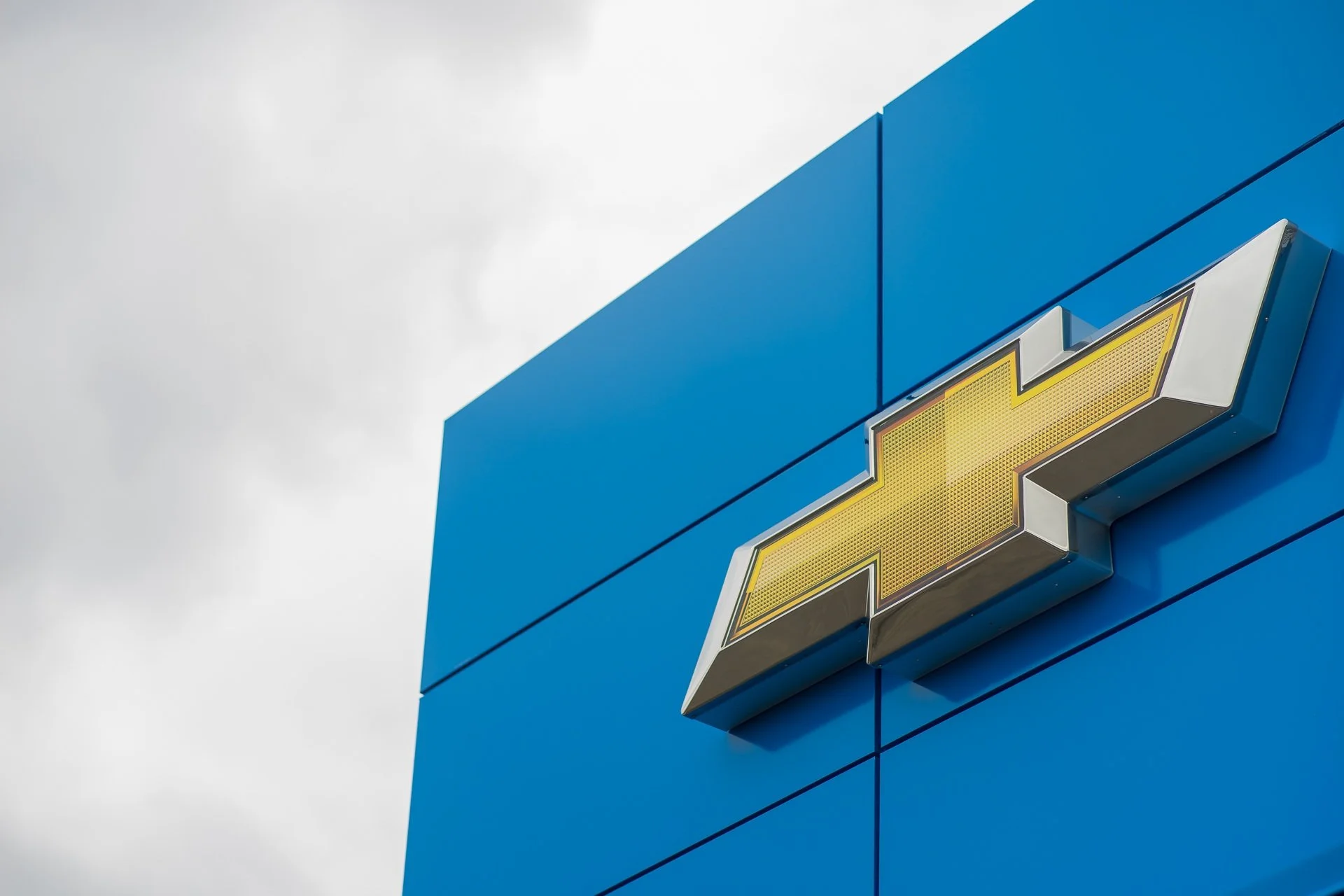
We enhanced the color palette by moving beyond the primary blue and white, introducing a vibrant, darker blue and a bright yellow for added contrast and energy.
A Cleaner Grid.
Enhanced Storytelling
Transforming the grid with finished projects, progress updates, product and manufacturer promotions.
With transparency in mind, we launched a social media video series showcasing behind-the-scenes footage of custom metal and panel fabrication processes. Adding a personal touch to the branding allows the audience to appreciate the craftsmanship behind each product.


